The following chart illustrates how diversity works in fair recruitment.
Imagine the graph below as a fat mole pushes up the carpet to get under. As he progresses, he gets thinner and thinner, until he gets to the other side, and finds the Mescaline. Despite being totally emaciated, he rockets up to the ceiling.
I’ve chosen that silly story, because it’s easy to remember. But what have thin moles and mescaline got to do with recruitment?
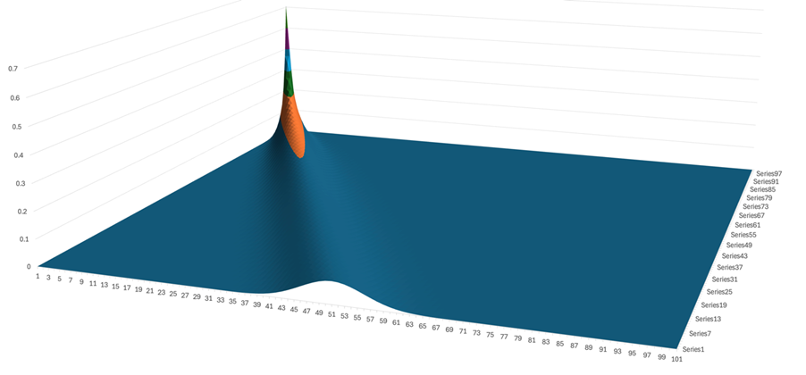
Left to right line – where the fat bump is – is the number of recruits out of 100 you have which have a Specified Protected Characteristic. (PC)
Line into the paper (or screen) this shows the percentage of people with that PC in your population of applicants. Nearest to us, we have 50%, which could represent women (or men) in the applicant population. This gives us a “bump of likelihood”.
As we go in, the percentages decreases – from 50% to ½%. The latter can be considered to represent the transgender community within the population.
You can see that the shape of the curve changes as we go inwards. It gets thinner at the bottom, and goes higher. Once we get to the end, it’s very very skinny and very very tall.
So what does the height tell us? That’s the probability of getting that outcome.
Nearest us, for 50% PCs in the population, there’s a spread around the 50% of around 15% maximum.
Furthest, there’s almost no spread at all – but clearly, results of 0 or 1 are very likely. I’ll look at the numbers later.
BUT the most important thing to note is how flat most of the curve is. That’s because a lot of possible results are really unlikely.
When I update this post, I’ll look at the “slices” that relate to 50%, 24% and ½%. Those represent the following populations:
| Percentage | Population |
| 50% | Females in UK population |
| 24% | BAME percentage of better degree earners (First or II(i)) in the UK |
| 0.5% | Transgender people in the UK |
Coming shortly!